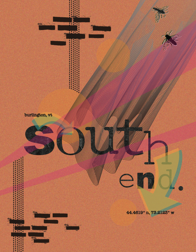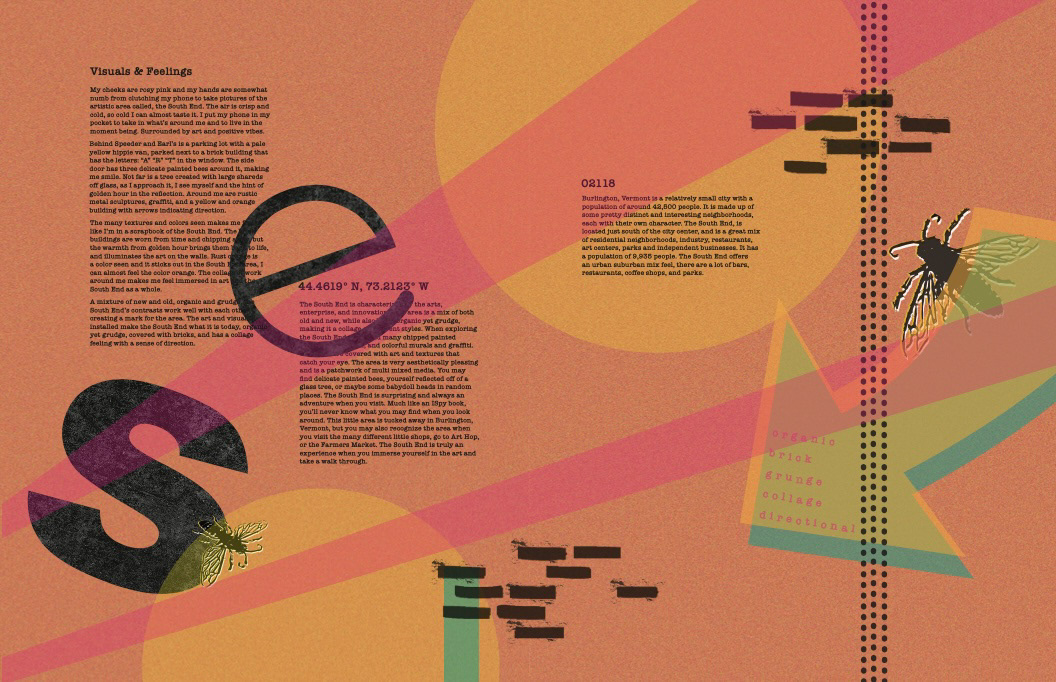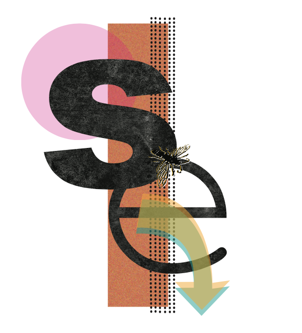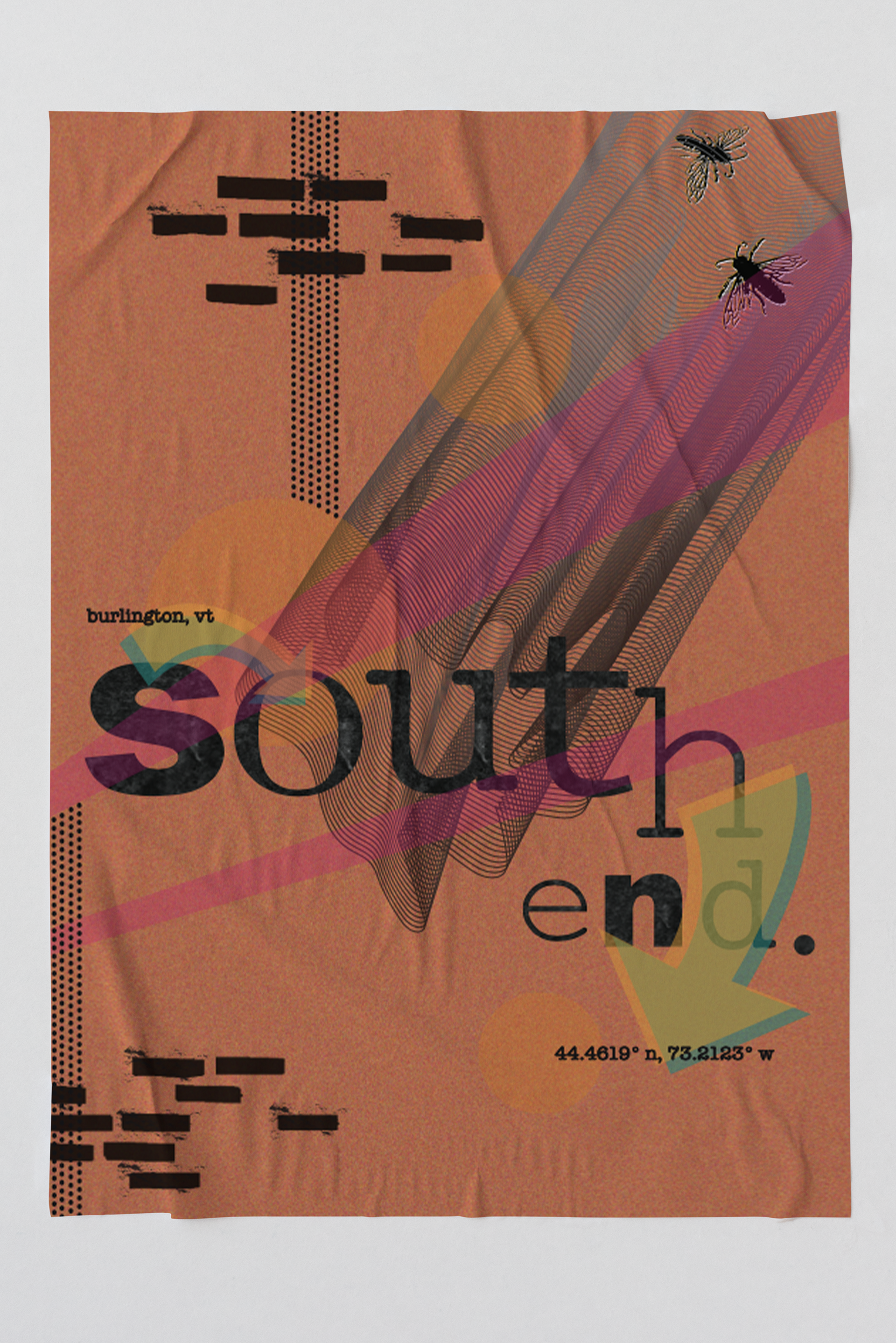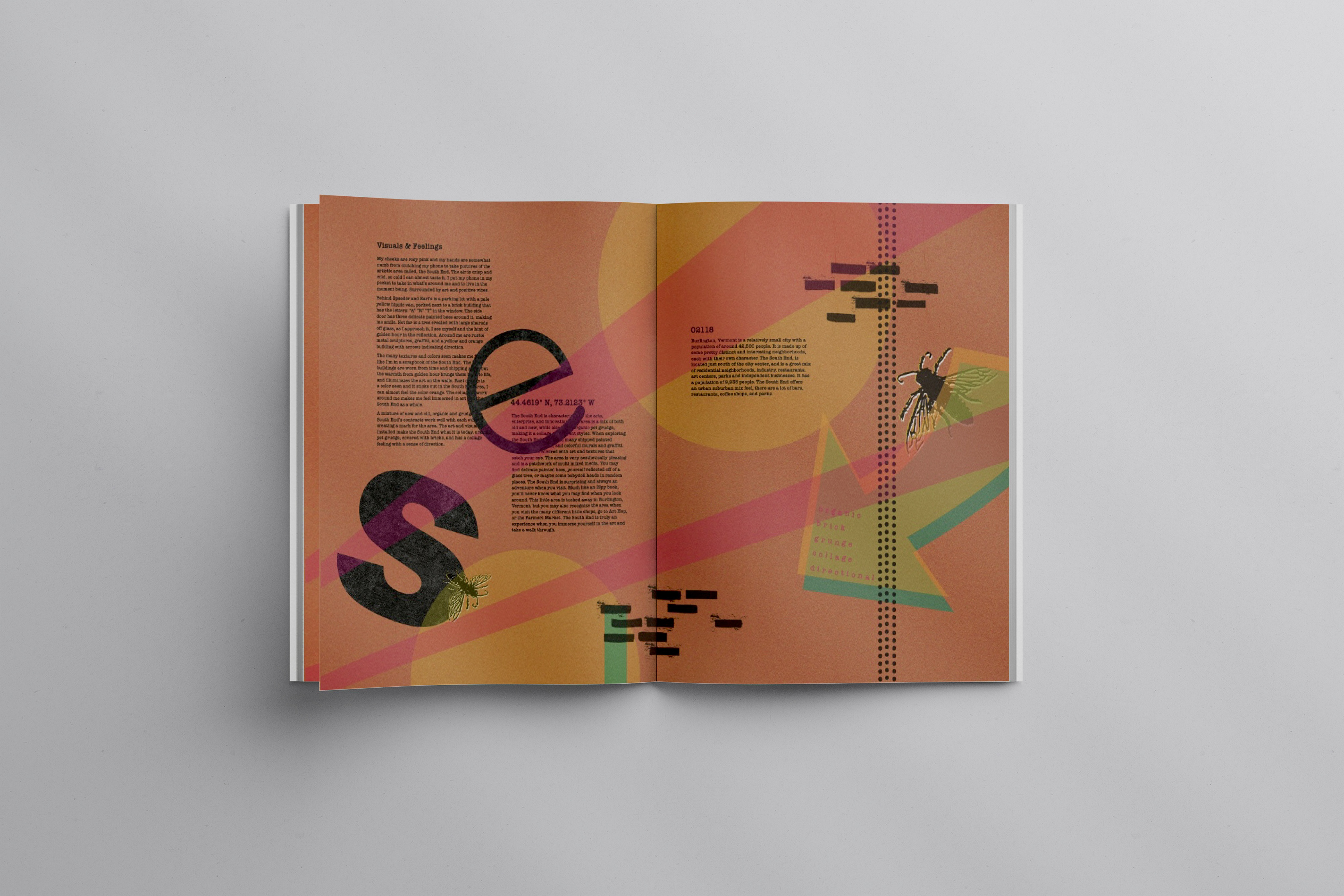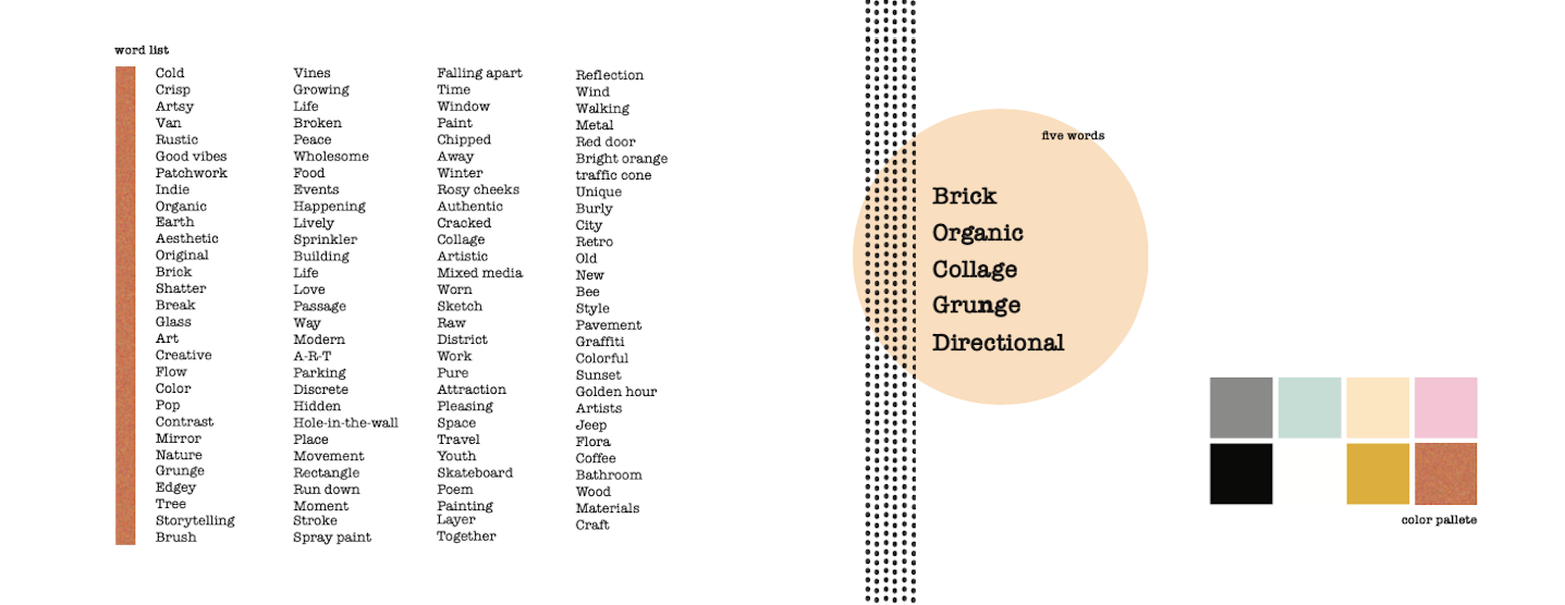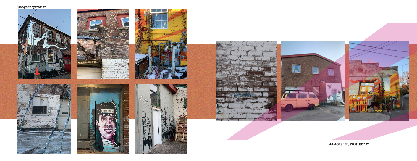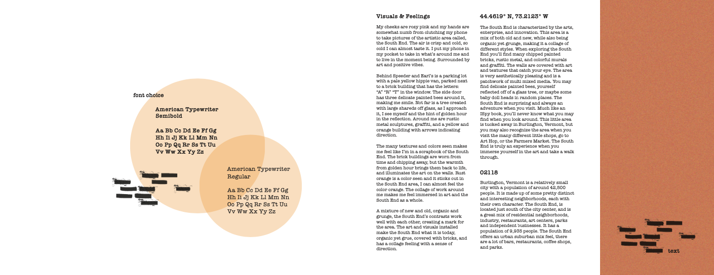
For this project, we explored the South End of Burlington, Vermont, capturing photographs that reflected the unique character and energy of the area. From those experiences, we developed a curated list of 100 descriptive words that best represented the South End’s identity.
Using this list as a foundation, we each created a poster design, magazine spread, and a final brand mark—all intended to visually embody the spirit of the neighborhood. From my personal word list, I was most inspired by: brick, organic, collage, grunge, and directional. These key themes guided the aesthetic and composition of my final designs, which aim to reflect the layered, textured, and creative vibe of the South End.