These designs were created for a talented silversmith friend of mine, who envisioned her brand under the name Wishbone Studio Co. She wanted her visual identity to reflect a warm, hand-drawn, and nature-inspired aesthetic—something that felt personal, earthy, and a little whimsical.
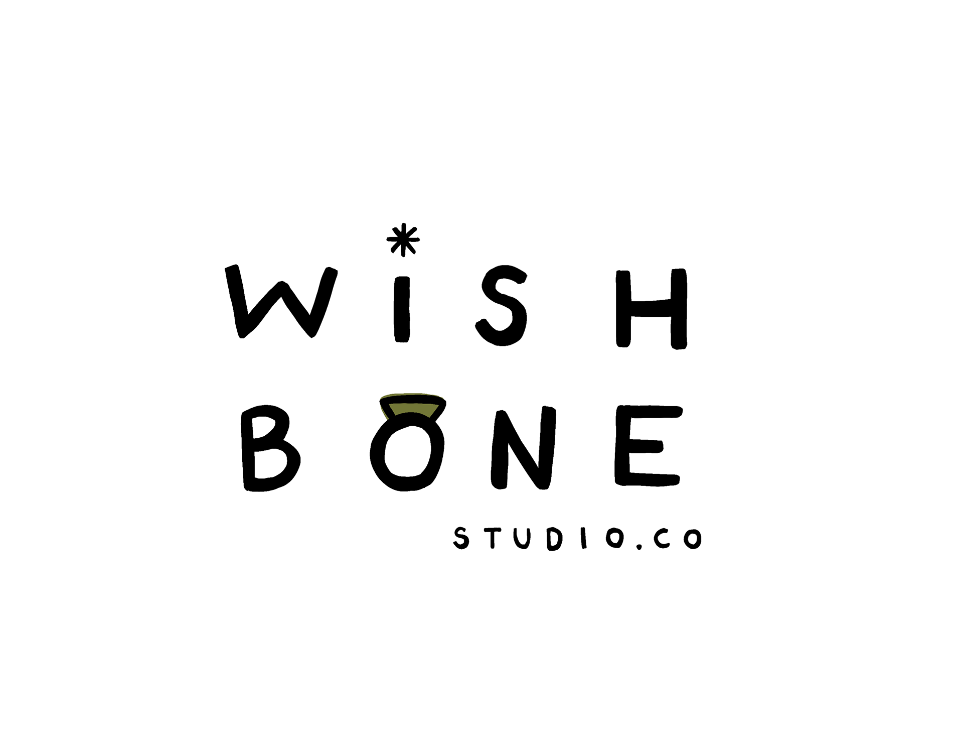
To bring that vision to life, I created two distinct logo concepts: one graphic-based and one typographic.
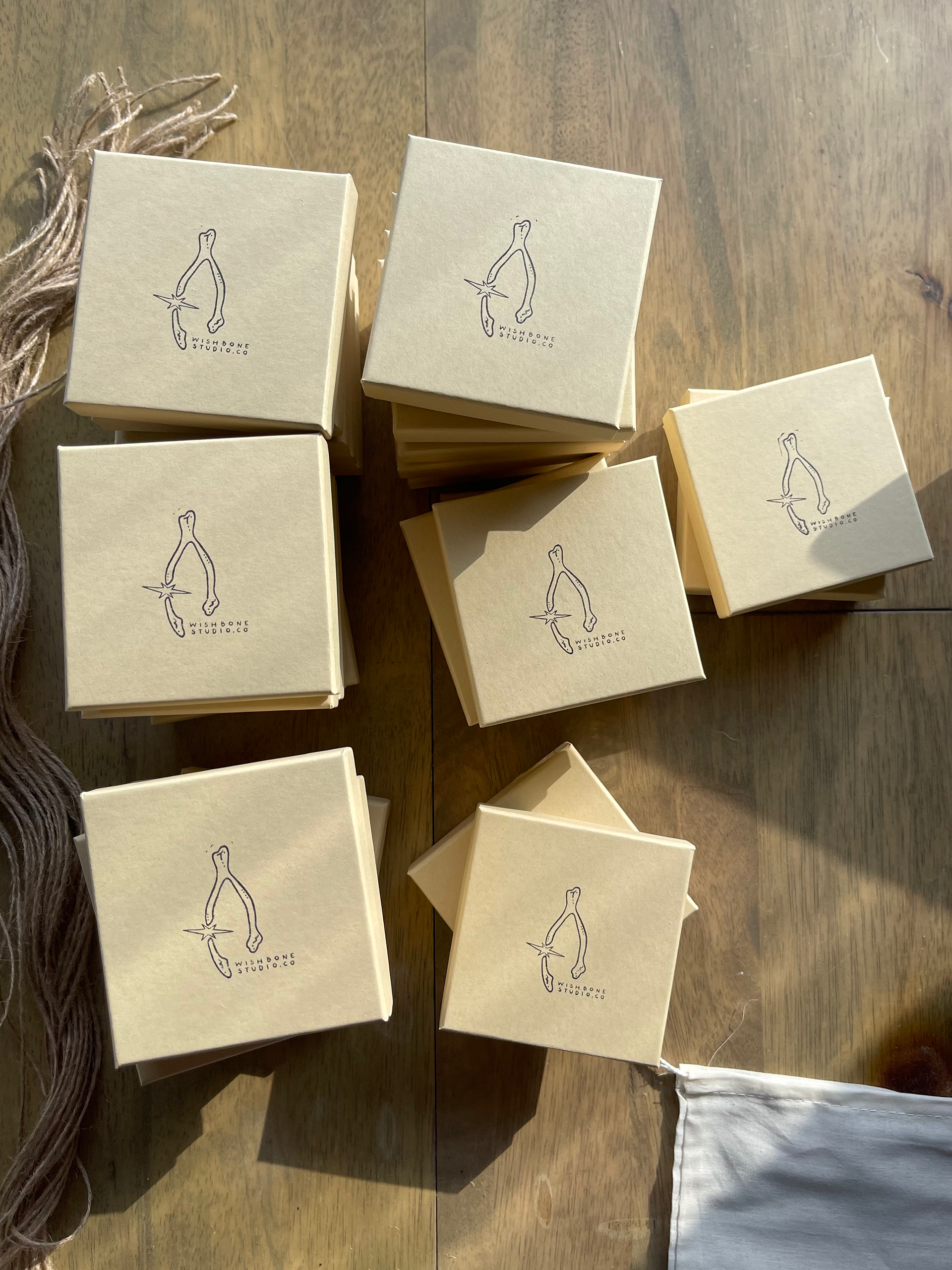
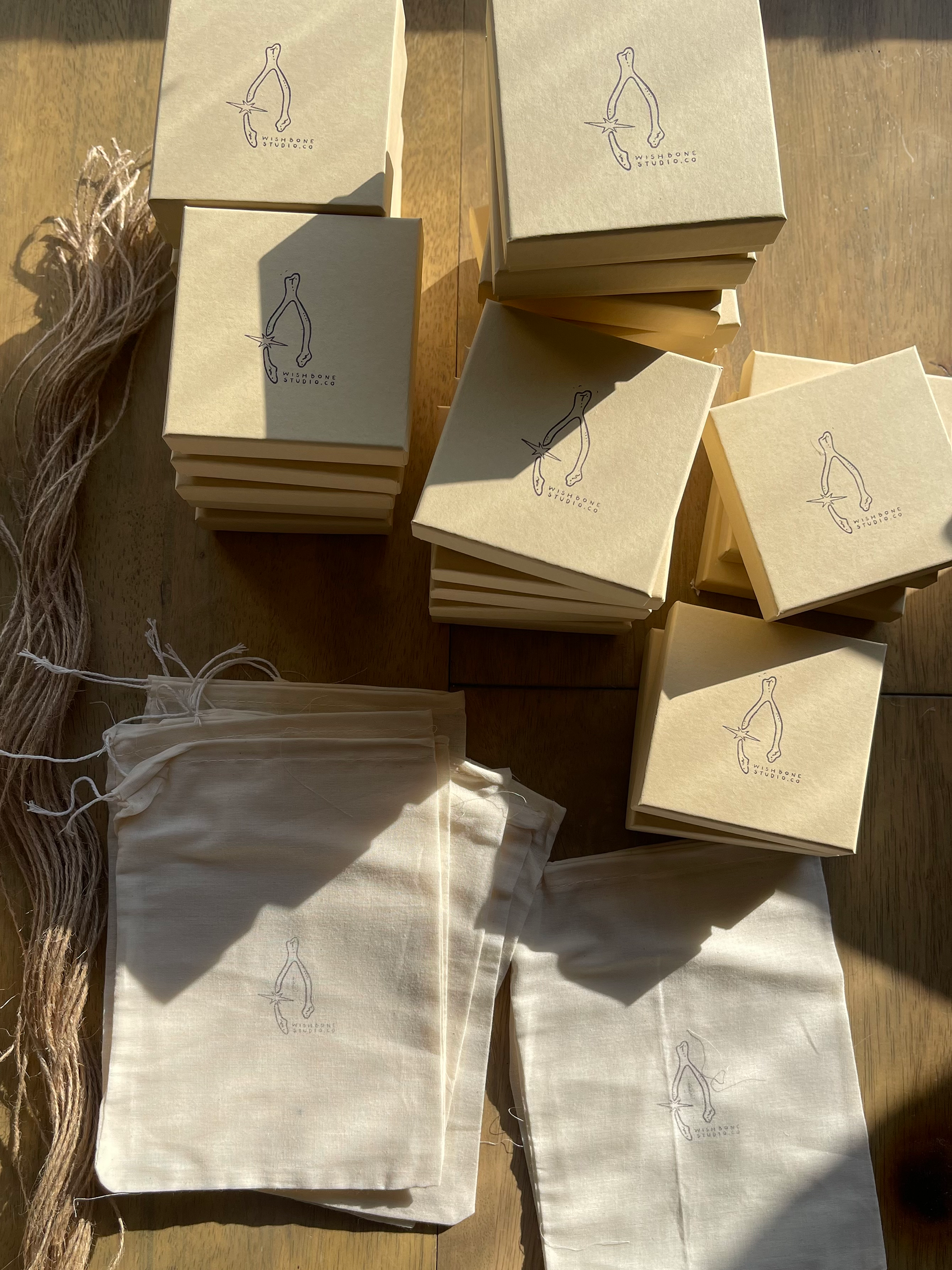
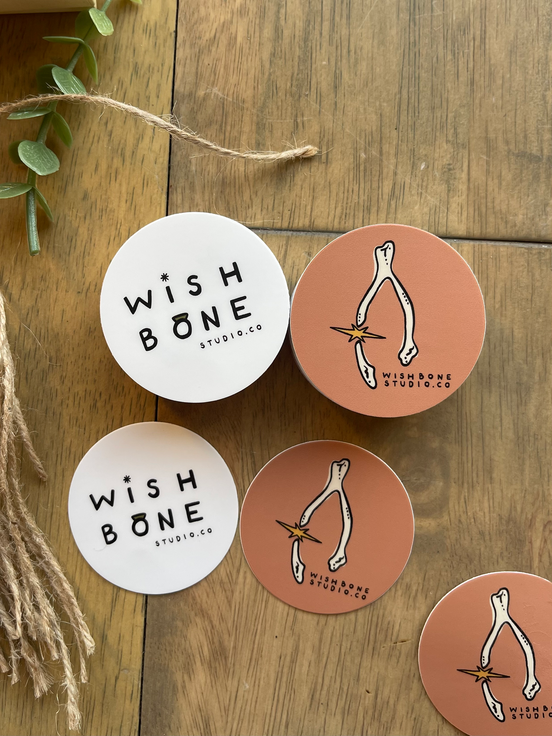
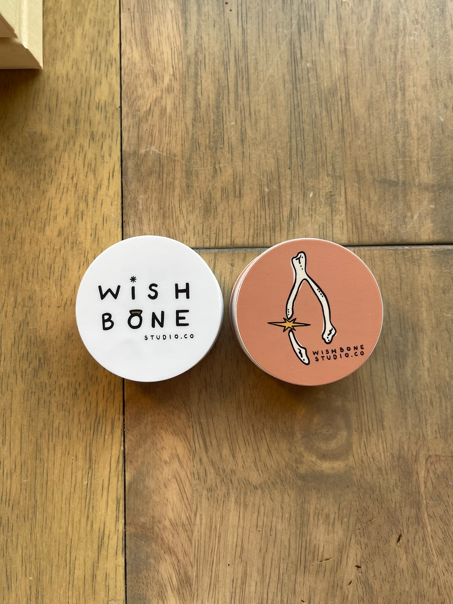
The graphic logo features a broken wishbone, symbolizing intention and hope. Between the break, I added a delicate starburst to suggest magic and possibility, along with subtle texture and dot details within the bone for added depth and handcrafted charm. The type accompanying this design is written in my own all-caps handwriting, intentionally imperfect to preserve the organic, hand-done quality she was looking for.
For the typographic logo, I used that same handwritten style on a larger scale. To add unique visual interest, I replaced the “o” with a ring—referencing her craft as a silversmith—and turned the dot of the “i” into a twinkle star to reinforce the dreamy vibe of the brand.
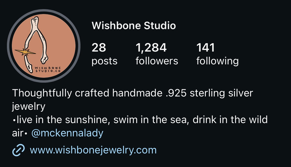
To complete the look, we selected a warm, inviting color palette for the social media version of the logo, helping to create a welcoming impression for her customers.